

In Core, you can create Forms for many reasons. They can act as a waiver, health questionnaire or provide information to the customer. Each form can be configured with multiple fields.
This article covers the following topics:
- TABLE OF CONTENTS
For a list of terms used in the Wellyx application & across the support website, please consult our Glossary.
Add/Edit Form Fields
Once, you have configured the form and how it will be triggered, you will then need to add fields to the form. From the left panel, drag and drop fields onto the form preview on the right to include them on your form. Fields can be placed above or below other fields by dragging them with the 3 dots. Each field has certain characteristics.
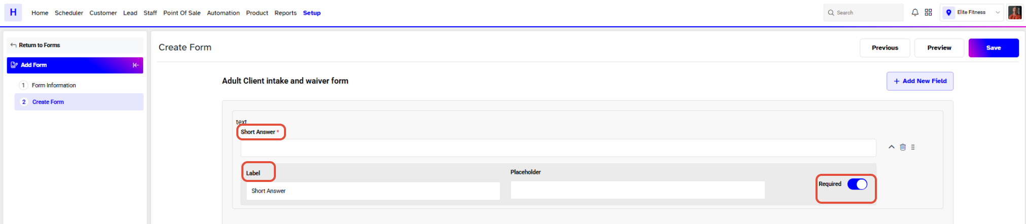
Short Answer:
Provide Customers to give brief but complete answers, i.e. Hair color, favorite class/service. This field has the following characteristics:
- Label: The name of the field that will appear on the live form.
- Placeholder: Text that appears in the input box for the field. The text will disappear when the customer enters a value in the field, and will not come through in the submission, even if the field is left empty.
- Required: Defines if the field is mandatory or not. The mandatory fields are marked with * on the form and when selected, the field must be completed to submit the form.
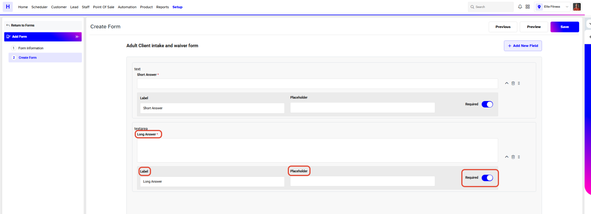
Long Answer:
Provide Customers with an opportunity to provide fuller information, i.e. Provide details of any health issues you have. This field has the following characteristics:
- Label: The name of the field that will appear on the live form.
- Placeholder: Text that appears in the input box for the field. The text will disappear when the customer enters a value in the field, and will not come through in the submission, even if the field is left empty.
- Required: Defines if the field is mandatory or not. The mandatory fields are marked with * on the form and when selected, the field must be completed to submit the form.
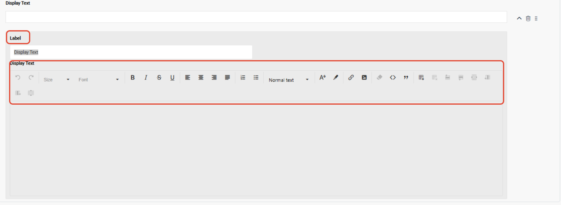
Display Text:
Similar to Paragraph, this field allows you to input text that is read-only and cannot be modified by the customer, i.e. Provide waivers or terms of service. This field has the following characteristics:
- Label: The name of the field that will appear on the live form.
- Display Text: Display text fields allow for the inclusion of text, tables, images, and links. Customize the Display design by selecting colours, fonts, and other styling options from the editing Toolbox.
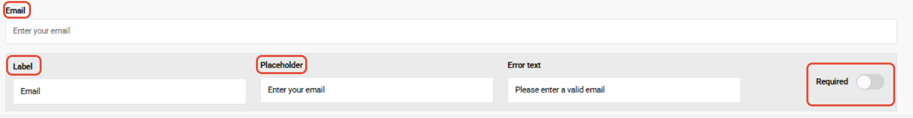
Email:
Provide Customers with an opportunity to provide an email address, i.e. support@wellyx.com. This field has the following characteristics:
- Label: The name of the field that will appear on the live form.
- Placeholder: Text that appears in the input box for the field. The text will disappear when the customer enters a value in the field, and will not come through in the submission, even if the field is left empty.
- Error Text: Error displayed to Customers who provide an email that does not meet the validation requirements of an email.
- Required: Defines if the field is mandatory or not. The mandatory fields are marked with * on the form and when selected, the field must be completed to submit the form.
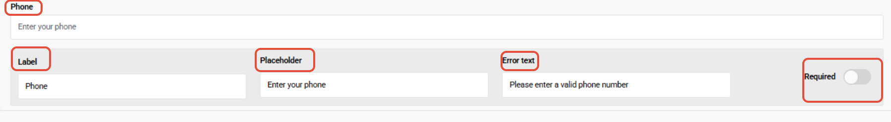
Phone:
Provide Customers with an opportunity to provide a phone number, i.e. 1 833 886 1660. This field has the following characteristics:
- Label: The name of the field that will appear on the live form.
- Placeholder: Text that appears in the input box for the field. The text will disappear when the customer enters a value in the field, and will not come through in the submission, even if the field is left empty.
- Error Text: Error displayed to Customers who provide a phone number that does not meet the validation requirements of a telephone number.
- Required: Defines if the field is mandatory or not. The mandatory fields are marked with * on the form and when selected, the field must be completed to submit the form.
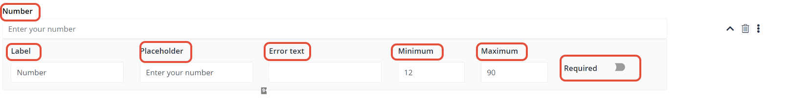
Number:
Provide Customers with an opportunity to provide a numeric response, i.e. Customer age. This field has the following characteristics:
- Label: The name of the field that will appear on the live form.
- Placeholder: Text that appears in the input box for the field. The text will disappear when the customer enters a value in the field, and will not come through in the submission, even if the field is left empty.
- Minimum: Set a limit for what is the least value you will accept.
- Maximum: Set a limit for what is the highest value you will accept.
- Error Text: Error displayed to Customers who provide a number that is outside the validation range.
- Required: Defines if the field is mandatory or not. The mandatory fields are marked with * on the form and when selected, the field must be completed to submit the form.
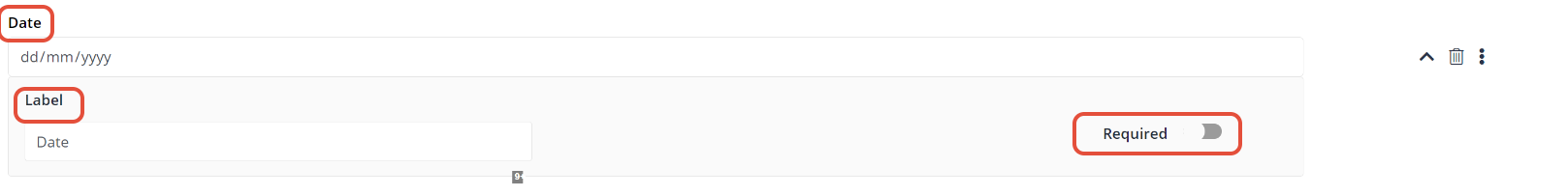
Date:
Provide Customers with an opportunity to provide a date response, i.e. Customer's date of birth. This field has the following characteristics:
- Label: The name of the field that will appear on the live form.
- Required: Defines if the field is mandatory or not. The mandatory fields are marked with * on the form and when selected, the field must be completed to submit the form.
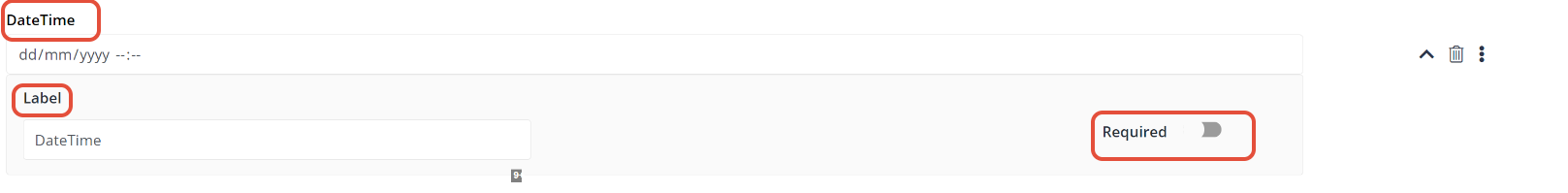
DateTime:
Provide Customers with an opportunity to provide a date and time response, i.e. Customer preferred appointment date and time. This field has the following characteristics:
- Label: The name of the field that will appear on the live form.
- Required: Defines if the field is mandatory or not. The mandatory fields are marked with * on the form and when selected, the field must be completed to submit the form.
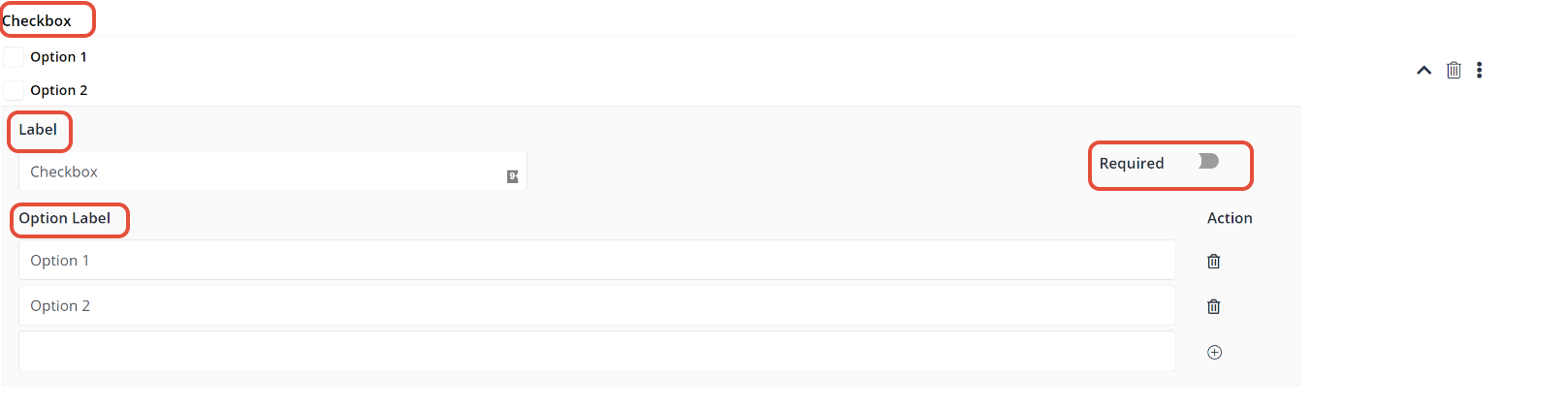
Checkbox:
Provides Customers with an option to select a value from a small set of options, often binary. Checkboxes can be singular or multiple, i.e. A checkbox can be used by the Customer to accept terms and conditions. This field has the following characteristics:
- Label: The name of the field that will appear on the live form.
- Option Label: The name next to the checkbox that will appear on the live form.
- Required: Defines if the field is mandatory or not. The mandatory fields are marked with * on the form and when selected, the field must be completed to submit the form.
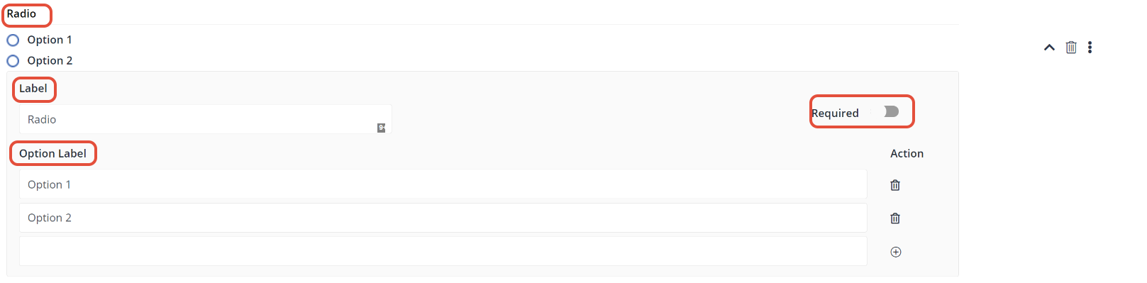
Radio:
A similar principle to checkboxes, but a radio field means it is an exclusive option, i.e. Only one option can be selected, when in a checkbox the Customer can select multiple checkboxes. This field has the following characteristics:
- Label: The name of the field that will appear on the live form.
- Option Label: The name next to the radio button that will appear on the live form.
- Required: Defines if the field is mandatory or not. The mandatory fields are marked with * on the form and when selected, the field must be completed to submit the form.
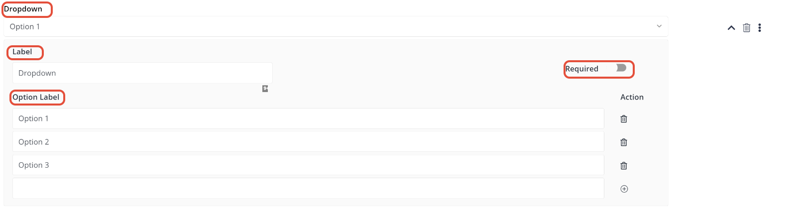
Dropdown:
A dropdown allows a Customer to select a value from a series of options, i.e. When trying to deduce gender, you can give a dropdown option of a Male and Female. This field has the following characteristics:
- Label: The name of the field that will appear on the live form.
- Option Label: The options that will appear in the dropdown on the live form.
- Required: Defines if the field is mandatory or not. The mandatory fields are marked with * on the form and when selected, the field must be completed to submit the form.
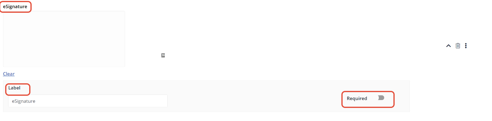
eSignature:
Provides Customer respondents with the ability to sign the form right before submission, i.e. Consent form, contracts, etc. This field has the following characteristics:
- Label: The name of the field that will appear on the live form.
- Required: Defines if the field is mandatory or not. The mandatory fields are marked with * on the form and when selected, the field must be completed to submit the form.
Links:
Provide Customers with an opportunity to access the website via URL routing. This field has the following characteristics:
- Label: The name of the field that will appear on the live form.
- URL: Enter the URL of the Website in the URL field.
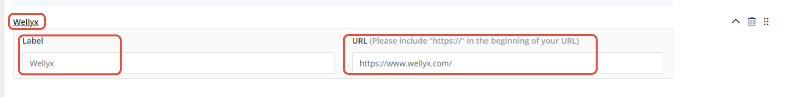
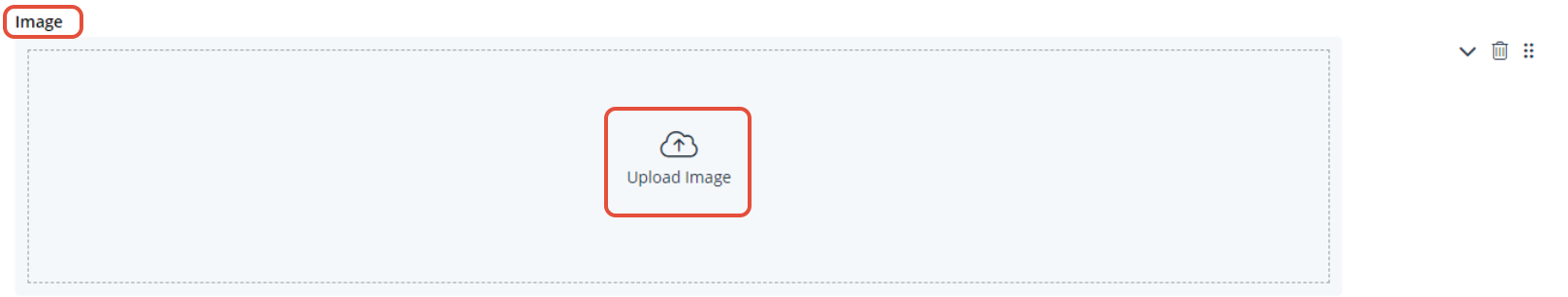
Image:
Provide Customers with an opportunity to view the image in the form. By adding the image in the form click on the Upload Image.
Preview Form:
Once you have selected your fields, you can preview the form to see how it looks to Customers. At the top right, click on Preview. A preview of the form will open in a popup window.
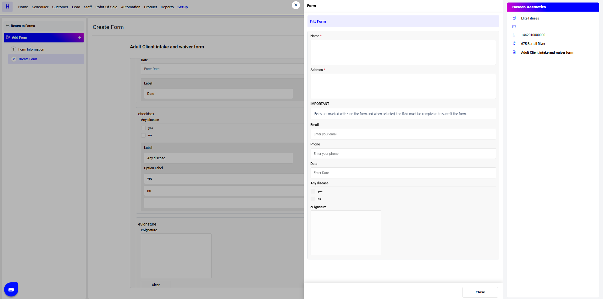
Note: On all forms a header will appear showing the following information, Company Name, Branch Name, Branch Email, Branch Phone, and a Tag if the form is mandatory.


